Every start-up company knows they need a logo. But when you offer logo design as a service you have to bring your “A” game immediately… No pressure right?!
That’s why I decided to do it a little different. I wanted to use my company as an experiment. For me, this is a challenge.
My dad is a builder. He builds amazing homes. His attention to detail is phenomenal, but that is only for his customers. The house I grew up in wasn’t finished until the day we moved out! It is true what they say: A builders house is never finished. But I have to give him a break; he was too busy building everyone else’s homes.
As I’ve been setting up B4 We Create this experience repeats in my mind. This creative entrepreneur is going to build my house and put the trim up! B4 We Create will have a defined brand, and the first step is the logo.
Logo design is one of the most exciting parts of developing a brand. Each month for one year I will redesign the B4 We Create logo, and I will share that process with you.
A lot more goes into designing a logo than putting some beautiful fonts together. My process starts with an understanding of the business and good-old inspiration.
B4 We Create Logo Design / Month 1:
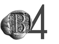
For the first month, I kept it simple. I had so much other work to do! I reverted to my comfort zone, a wax seal “B” that I’ve used on my resume for years. It’s an oldie, but goodie. I grew up in Williamsburg, Virginia, an area known for its historical heritage. The wax seal has always fit me as an individual. I love this mark; it has served me well. It has gotten me a lot of design work because it is memorable.
B4 We Create Logo Design / Month 2:
For month two, the inspiration came from my 6-year-old son. He was wondering around in our yard and found a four leaf clover. That kid was so excited, with a huge smile on his face said: “We are so lucky”! The next day I started this business.
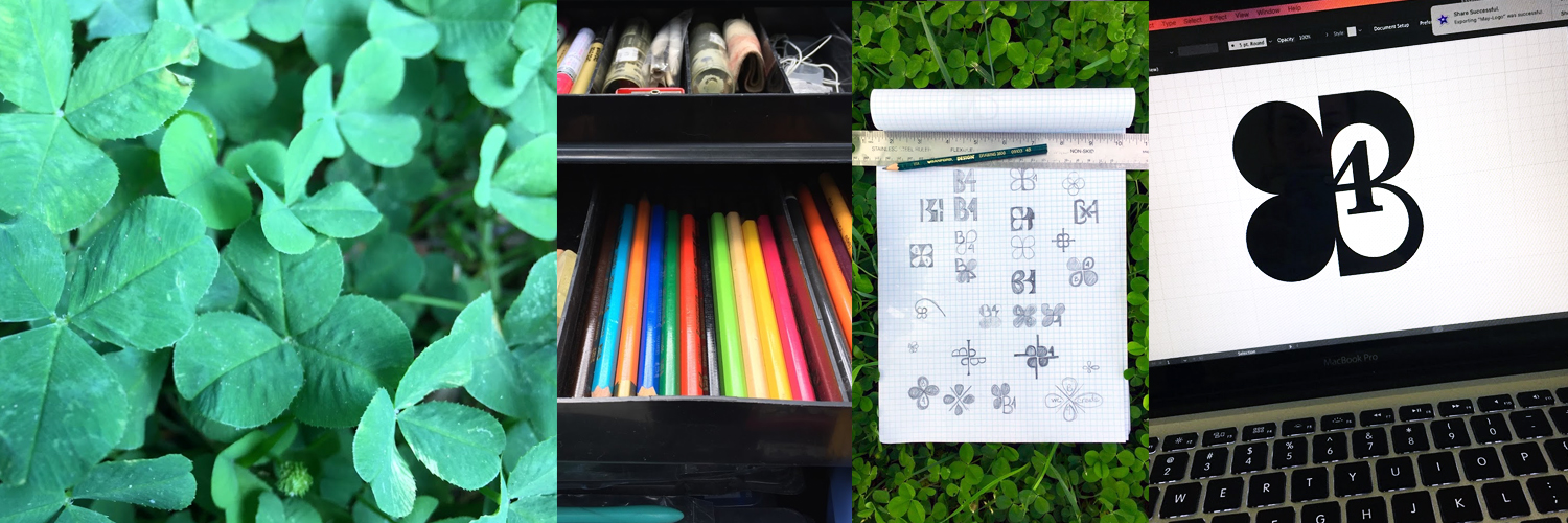
The design process went something like this:
- Take pictures of clovers.
- Sketch.
- Study the forms and shapes.
- See how I could incorporate B4 into the forms.

I want this logo to resonate with people visiting my website or getting a business card. The clover is a symbol of luck and who doesn’t want to be lucky, especially when they start a new business?
I use Adobe Illustrator to digitize my concepts. I like the way this design fits in a square. All of the social media platforms have a square or circle profile image. This design lends itself well to those specifications.
After I define the shapes, I experiment with fonts. Here I chose Baskerville for the number four and Gill Sans for the company name.
Finally, I apply color. Teal just feels right to me. It reinforces the clover image without being too green.
So here we have it–B4 We Create’s May 2017 logo!
