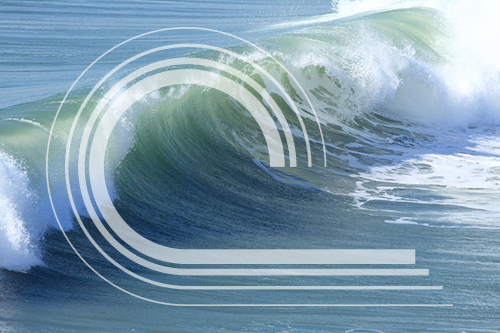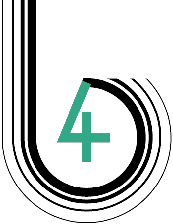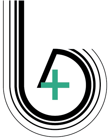
Our family was fortunate to spend the July 4th weekend at the river – or as locals like to say, “the Rivah”. While we were there I watched as passing boats created the most beautiful curved waves. The shape of the “b” is meant to resemble that motion.
In this design, the “b” also repeats itself like waterdrop rings, 4 times (of course!). The ripples signify cause and effect, a central consideration when I design a brand or develop marketing material; If you have a message to “drop” in your community how will it resonate with your target audience.
The number “4″ comes to a close in the counter space of the “b”. It’s finished with a symmetrical cross, the source of my inspiration.


Creative Services
Brand Management
- identity design
- brand strategy
- brand standards
Graphic Design
- newsletters
- promotional material
- packaging
- digital + print advertisements
- swag
Environmental Design
- signs
- tradeshows
- exhibit planning
Marketing
- plan development
- strategy
- execution
Online Representation
- website design
- WordPress development
- social media marketing
- search engine optimization (SEO)
- email blast
Follow the process on social media where I’ll be sharing the Logo Experiment plus all kinds other news and musings from B4 We Create.
B4 We Create Logo Design / Month 4:
The design process:
- Connect with nature. Relax and open up to inspiration in my environment.
- Eureka Moment!
- Digitize the idea.
- Thank God for the inspiration.
B4 We Create’s July 2017 Logo!

