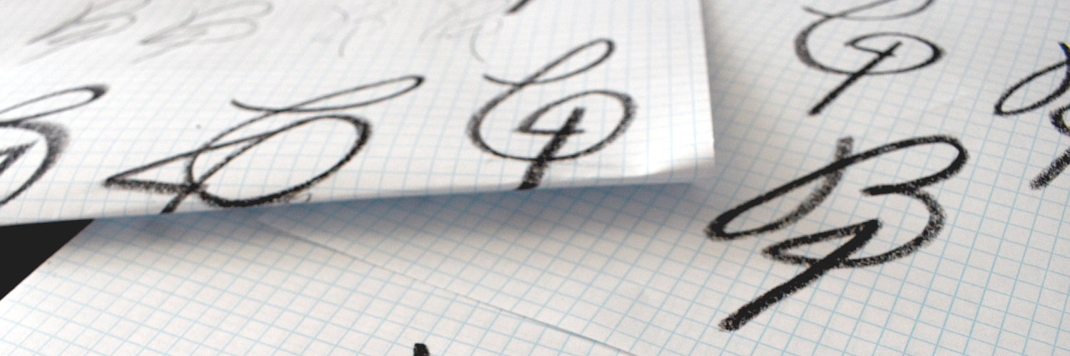
This month for the B4 We Create logo experiment I wanted to experiment with texture and hand-lettering rather than the computer. This single line logo is a shape I have been toying with for a few months now and when I found my oil pastels buried in the toolbox the two just seemed like a natural match.

The letter B flows right into the number 4. I am pretty excited about how the fish icon worked itself into the front part of the “B.” The oil pastels give this logo a nice texture. So many icons and logos are designed via the computer anymore that something hand-drawn uniquely stands out.
To get the effect I wanted the process began on graph paper with an oil pastel. Then I scanned the image and cleaned up the image in Adobe Photoshop. Next, I imported the picture into Adobe Illustrator and used the image trace function to outline the details of the lettering. Now I have a digitized logo that is vector art that I can use at any size I’ll need. Saving the logo as a vector file is essential for a logo because if you have a raster art logo file, you lose the flexibility of enlarging the image. Read more about that in another article from B4 We Create. A raster file needs to be 300 dpi to print clearly since you can’t make it any bigger than that you become limited as to how the logo can be reproduced. With a vector file, I can expand the are to any size I want; small as a browser favicon or large as a billboard. Hmmm…. I wonder how a B4 We Create billboard would look… Dream big, right!
Creative Services
Brand Management
- identity design
- brand strategy
- brand standards
Graphic Design
- newsletters
- promotional material
- packaging
- digital + print advertisements
- swag
Environmental Design
- signs
- tradeshows
- exhibit planning
Marketing
- plan development
- strategy
- execution
Online Representation
- website design
- WordPress development
- social media marketing
- search engine optimization (SEO)
- email blast

