Logo Design

Project Details
Client:
The Stand School
Skills:
Branding
Logo Design
Illustration
Typography
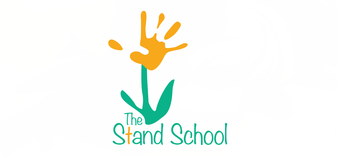
Logo Developed for a Christian Preschool
It was meant to embody the school’s image as a place to play, learn and grow in a Christian setting:
• The “t” in “Stand” is gold so that the shape of the cross stands out.
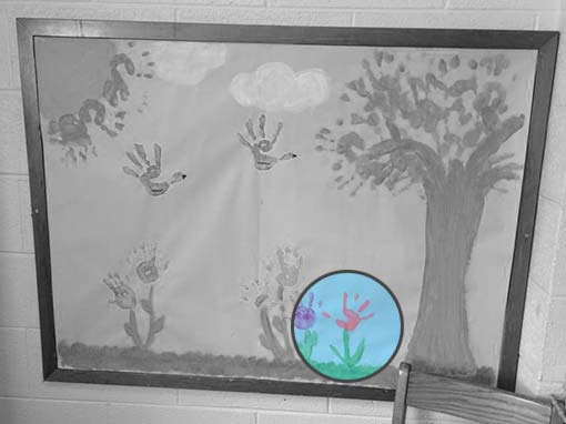
• The hand print was drawn based on the handprint of one of the students of the school, see below.
• The font was chosen to be fun and free-spirited like youth should be.

Design Inspiration
When developing this logo, I searched for inspiration in the environment for which I was designing. This part of my creative process that helps inspire truly unique and custom designs. The concept for the logo was developed by opening my eyes to the beauty that already existed in the school. Taking that inspiration, I was able to communicate the preschool’s brand in a youthful.
