Logo Design

Project Details
Client:
New Kent Christian Academy
Skills:
Branding
Logo Design
Illustration
Typography
Logo Developed for a Christian Preschool
The logo for this newly opened school was created to develop its unique identity, while also allowing for some resemblance to its governing church body:
• The wings of the butterfly are open like the doors of the school.
• The body of the butterfly is meant to reflect the teacher and student relationship.
• The arms of these two figures also double as a reference to the building facade along with the roof line that frames the butterfly.
• The large green swoosh at the bottom is the element that connects this logo to the churches original logo.
• I chose to use this san serif font to anchor the logo.

Design Inspiration
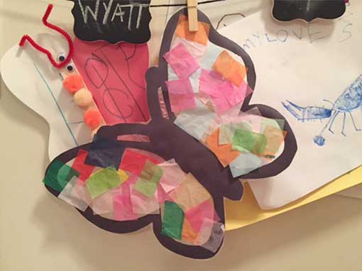
The image of the butterfly was inspired by an art project created by the school’s littlest arts.
“A child is like a butterfly in the wind. Some can fly higher than others, but each one flies the best it can. Why compare one against the other? Each one is special each one is beautiful.” – Author Unknown
